This chapter will show you how to use visualisation and transformation to explore your data in a systematic way, a task that statisticians call exploratory data analysis, or EDA for short. EDA is an iterative cycle. You:
Generate questions about your data.
Search for answers by visualising, transforming, and modelling your data.
Use what you learn to refine your questions and/or generate new questions.
EDA is not a formal process with a strict set of rules. More than anything, EDA is a state of mind. During the initial phases of EDA you should feel free to investigate every idea that occurs to you. Some of these ideas will pan out, and some will be dead ends. As your exploration continues, you will home in on a few particularly productive areas that you’ll eventually write up and communicate to others.
EDA is an important part of any data analysis, even if the questions are handed to you on a platter, because you always need to investigate the quality of your data. Data cleaning is just one application of EDA: you ask questions about whether your data meets your expectations or not. To do data cleaning, you’ll need to deploy all the tools of EDA: visualisation, transformation, and modelling.
“There are no routine statistical questions, only questionable statistical routines.” — Sir David Cox
“Far better an approximate answer to the right question, which is often vague, than an exact answer to the wrong question, which can always be made precise.” — John Tukey
Your goal during EDA is to develop an understanding of your data. The easiest way to do this is to use questions as tools to guide your investigation. When you ask a question, the question focuses your attention on a specific part of your dataset and helps you decide which graphs, models, or transformations to make.
EDA is fundamentally a creative process. And like most creative processes, the key to asking quality questions is to generate a large quantity of questions. It is difficult to ask revealing questions at the start of your analysis because you do not know what insights are contained in your dataset. On the other hand, each new question that you ask will expose you to a new aspect of your data and increase your chance of making a discovery. You can quickly drill down into the most interesting parts of your data—and develop a set of thought-provoking questions—if you follow up each question with a new question based on what you find.
There is no rule about which questions you should ask to guide your research. However, two types of questions will always be useful for making discoveries within your data. You can loosely word these questions as:
What type of variation occurs within my variables?
What type of covariation occurs between my variables?
The rest of this chapter will look at these two questions. I’ll explain what variation and covariation are, and I’ll show you several ways to answer each question. To make the discussion easier, let’s define some terms:
A variable is a quantity, quality, or property that you can measure.
A value is the state of a variable when you measure it. The value of a variable may change from measurement to measurement.
An observation is a set of measurements made under similar conditions (you usually make all of the measurements in an observation at the same time and on the same object). An observation will contain several values, each associated with a different variable. I’ll sometimes refer to an observation as a data point.
Tabular data is a set of values, each associated with a variable and an observation. Tabular data is tidy if each value is placed in its own “cell”, each variable in its own column, and each observation in its own row.
So far, all of the data that you’ve seen has been tidy. In real-life, most data isn’t tidy, so we’ll come back to these ideas again in tidy data.
Variation is the tendency of the values of a variable to change from measurement to measurement. You can see variation easily in real life; if you measure any continuous variable twice, you will get two different results. This is true even if you measure quantities that are constant, like the speed of light. Each of your measurements will include a small amount of error that varies from measurement to measurement. Categorical variables can also vary if you measure across different subjects (e.g. the eye colors of different people), or different times (e.g. the energy levels of an electron at different moments). Every variable has its own pattern of variation, which can reveal interesting information. The best way to understand that pattern is to visualise the distribution of the variable’s values.
How you visualise the distribution of a variable will depend on whether the variable is categorical or continuous. A variable is categorical if it can only take one of a small set of values. In R, categorical variables are usually saved as factors or character vectors. To examine the distribution of a categorical variable, use a bar chart:
ggplot(data = diamonds) +
  geom_bar(mapping = aes(x = cut))
The height of the bars displays how many observations occurred with each x value. You can compute these values manually with dplyr::count():
diamonds %>%
  count(cut)
#> # A tibble: 5 x 2
#>   cut           n
#>   <ord>     <int>
#> 1 Fair       1610
#> 2 Good       4906
#> 3 Very Good 12082
#> 4 Premium   13791
#> 5 Ideal     21551
A variable is continuous if it can take any of an infinite set of ordered values. Numbers and date-times are two examples of continuous variables. To examine the distribution of a continuous variable, use a histogram:
ggplot(data = diamonds) +
  geom_histogram(mapping = aes(x = carat), binwidth = 0.5)
You can compute this by hand by combining dplyr::count() and ggplot2::cut_width():
diamonds %>%
  count(cut_width(carat, 0.5))
#> # A tibble: 11 x 2
#>   `cut_width(carat, 0.5)`     n
#>   <fct>                   <int>
#> 1 [-0.25,0.25]              785
#> 2 (0.25,0.75]             29498
#> 3 (0.75,1.25]             15977
#> 4 (1.25,1.75]              5313
#> 5 (1.75,2.25]              2002
#> 6 (2.25,2.75]               322
#> # … with 5 more rows
A histogram divides the x-axis into equally spaced bins and then uses the height of a bar to display the number of observations that fall in each bin. In the graph above, the tallest bar shows that almost 30,000 observations have a carat value between 0.25 and 0.75, which are the left and right edges of the bar.
You can set the width of the intervals in a histogram with the binwidth argument, which is measured in the units of the x variable. You should always explore a variety of binwidths when working with histograms, as different binwidths can reveal different patterns. For example, here is how the graph above looks when we zoom into just the diamonds with a size of less than three carats and choose a smaller binwidth.
smaller <- diamonds %>%
  filter(carat < 3)

ggplot(data = smaller, mapping = aes(x = carat)) +
  geom_histogram(binwidth = 0.1)
If you wish to overlay multiple histograms in the same plot, I recommend using geom_freqpoly() instead of geom_histogram(). geom_freqpoly() performs the same calculation as geom_histogram(), but instead of displaying the counts with bars, uses lines instead. It’s much easier to understand overlapping lines than bars.
ggplot(data = smaller, mapping = aes(x = carat, colour = cut)) +
  geom_freqpoly(binwidth = 0.1)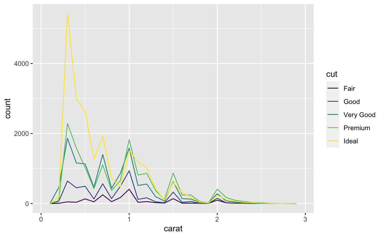
There are a few challenges with this type of plot, which we will come back to in visualising a categorical and a continuous variable.
Now that you can visualise variation, what should you look for in your plots? And what type of follow-up questions should you ask? I’ve put together a list below of the most useful types of information that you will find in your graphs, along with some follow-up questions for each type of information. The key to asking good follow-up questions will be to rely on your curiosity (What do you want to learn more about?) as well as your skepticism (How could this be misleading?).
In both bar charts and histograms, tall bars show the common values of a variable, and shorter bars show less-common values. Places that do not have bars reveal values that were not seen in your data. To turn this information into useful questions, look for anything unexpected:
Which values are the most common? Why?
Which values are rare? Why? Does that match your expectations?
Can you see any unusual patterns? What might explain them?
As an example, the histogram below suggests several interesting questions:
Why are there more diamonds at whole carats and common fractions of carats?
Why are there more diamonds slightly to the right of each peak than there are slightly to the left of each peak?
Why are there no diamonds bigger than 3 carats?
ggplot(data = smaller, mapping = aes(x = carat)) +
  geom_histogram(binwidth = 0.01)
Clusters of similar values suggest that subgroups exist in your data. To understand the subgroups, ask:
How are the observations within each cluster similar to each other?
How are the observations in separate clusters different from each other?
How can you explain or describe the clusters?
Why might the appearance of clusters be misleading?
The histogram below shows the length (in minutes) of 272 eruptions of the Old Faithful Geyser in Yellowstone National Park. Eruption times appear to be clustered into two groups: there are short eruptions (of around 2 minutes) and long eruptions (4-5 minutes), but little in between.
ggplot(data = faithful, mapping = aes(x = eruptions)) +
  geom_histogram(binwidth = 0.25)
Many of the questions above will prompt you to explore a relationship between variables, for example, to see if the values of one variable can explain the behavior of another variable. We’ll get to that shortly.
Outliers are observations that are unusual; data points that don’t seem to fit the pattern. Sometimes outliers are data entry errors; other times outliers suggest important new science. When you have a lot of data, outliers are sometimes difficult to see in a histogram. For example, take the distribution of the y variable from the diamonds dataset. The only evidence of outliers is the unusually wide limits on the x-axis.
ggplot(diamonds) +
  geom_histogram(mapping = aes(x = y), binwidth = 0.5)
There are so many observations in the common bins that the rare bins are so short that you can’t see them (although maybe if you stare intently at 0 you’ll spot something). To make it easy to see the unusual values, we need to zoom to small values of the y-axis with coord_cartesian():
ggplot(diamonds) +
  geom_histogram(mapping = aes(x = y), binwidth = 0.5) +
  coord_cartesian(ylim = c(0, 50))
(coord_cartesian() also has an xlim() argument for when you need to zoom into the x-axis. ggplot2 also has xlim() and ylim() functions that work slightly differently: they throw away the data outside the limits.)
This allows us to see that there are three unusual values: 0, ~30, and ~60. We pluck them out with dplyr:
unusual <- diamonds %>%
  filter(y < 3 | y > 20) %>%
  select(price, x, y, z) %>%
  arrange(y)
unusual
#> # A tibble: 9 x 4
#>   price     x     y     z
#>   <int> <dbl> <dbl> <dbl>
#> 1  5139  0      0    0
#> 2  6381  0      0    0
#> 3 12800  0      0    0
#> 4 15686  0      0    0
#> 5 18034  0      0    0
#> 6  2130  0      0    0
#> 7  2130  0      0    0
#> 8  2075  5.15  31.8  5.12
#> 9 12210  8.09  58.9  8.06
The y variable measures one of the three dimensions of these diamonds, in mm. We know that diamonds can’t have a width of 0mm, so these values must be incorrect. We might also suspect that measurements of 32mm and 59mm are implausible: those diamonds are over an inch long, but don’t cost hundreds of thousands of dollars!
It’s good practice to repeat your analysis with and without the outliers. If they have minimal effect on the results, and you can’t figure out why they’re there, it’s reasonable to replace them with missing values, and move on. However, if they have a substantial effect on your results, you shouldn’t drop them without justification. You’ll need to figure out what caused them (e.g. a data entry error) and disclose that you removed them in your write-up.
If you’ve encountered unusual values in your dataset, and simply want to move on to the rest of your analysis, you have two options.
Drop the entire row with the strange values:
diamonds2 <- diamonds %>%
  filter(between(y, 3, 20))
I don’t recommend this option because just because one measurement is invalid, doesn’t mean all the measurements are. Additionally, if you have low quality data, by time that you’ve applied this approach to every variable you might find that you don’t have any data left!
Instead, I recommend replacing the unusual values with missing values. The easiest way to do this is to use mutate() to replace the variable with a modified copy. You can use the ifelse() function to replace unusual values with NA:
diamonds2 <- diamonds %>%
  mutate(y = ifelse(y < 3 | y > 20, NA, y))
ifelse() has three arguments. The first argument test should be a logical vector. The result will contain the value of the second argument, yes, when test is TRUE, and the value of the third argument, no, when it is false. Alternatively to ifelse, use dplyr::case_when(). case_when() is particularly useful inside mutate when you want to create a new variable that relies on a complex combination of existing variables.
Like R, ggplot2 subscribes to the philosophy that missing values should never silently go missing. It’s not obvious where you should plot missing values, so ggplot2 doesn’t include them in the plot, but it does warn that they’ve been removed:
ggplot(data = diamonds2, mapping = aes(x = x, y = y)) +
  geom_point()
#> Warning: Removed 9 rows containing missing values (geom_point).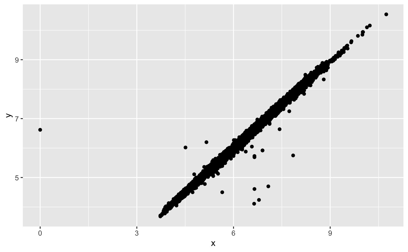
To suppress that warning, set na.rm = TRUE:
ggplot(data = diamonds2, mapping = aes(x = x, y = y)) +
  geom_point(na.rm = TRUE)
Other times you want to understand what makes observations with missing values different to observations with recorded values. For example, in nycflights13::flights, missing values in the dep_time variable indicate that the flight was cancelled. So you might want to compare the scheduled departure times for cancelled and non-cancelled times. You can do this by making a new variable with is.na().
nycflights13::flights %>%
  mutate(
    cancelled = is.na(dep_time),
    sched_hour = sched_dep_time %/% 100,
    sched_min = sched_dep_time %% 100,
    sched_dep_time = sched_hour + sched_min / 60
  ) %>%
  ggplot(mapping = aes(sched_dep_time)) +
    geom_freqpoly(mapping = aes(colour = cancelled), binwidth = 1/4)
However this plot isn’t great because there are many more non-cancelled flights than cancelled flights. In the next section we’ll explore some techniques for improving this comparison.
If variation describes the behavior within a variable, covariation describes the behavior between variables. Covariation is the tendency for the values of two or more variables to vary together in a related way. The best way to spot covariation is to visualise the relationship between two or more variables. How you do that should again depend on the type of variables involved.
It’s common to want to explore the distribution of a continuous variable broken down by a categorical variable, as in the previous frequency polygon. The default appearance of geom_freqpoly() is not that useful for that sort of comparison because the height is given by the count. That means if one of the groups is much smaller than the others, it’s hard to see the differences in shape. For example, let’s explore how the price of a diamond varies with its quality:
ggplot(data = diamonds, mapping = aes(x = price)) +
  geom_freqpoly(mapping = aes(colour = cut), binwidth = 500)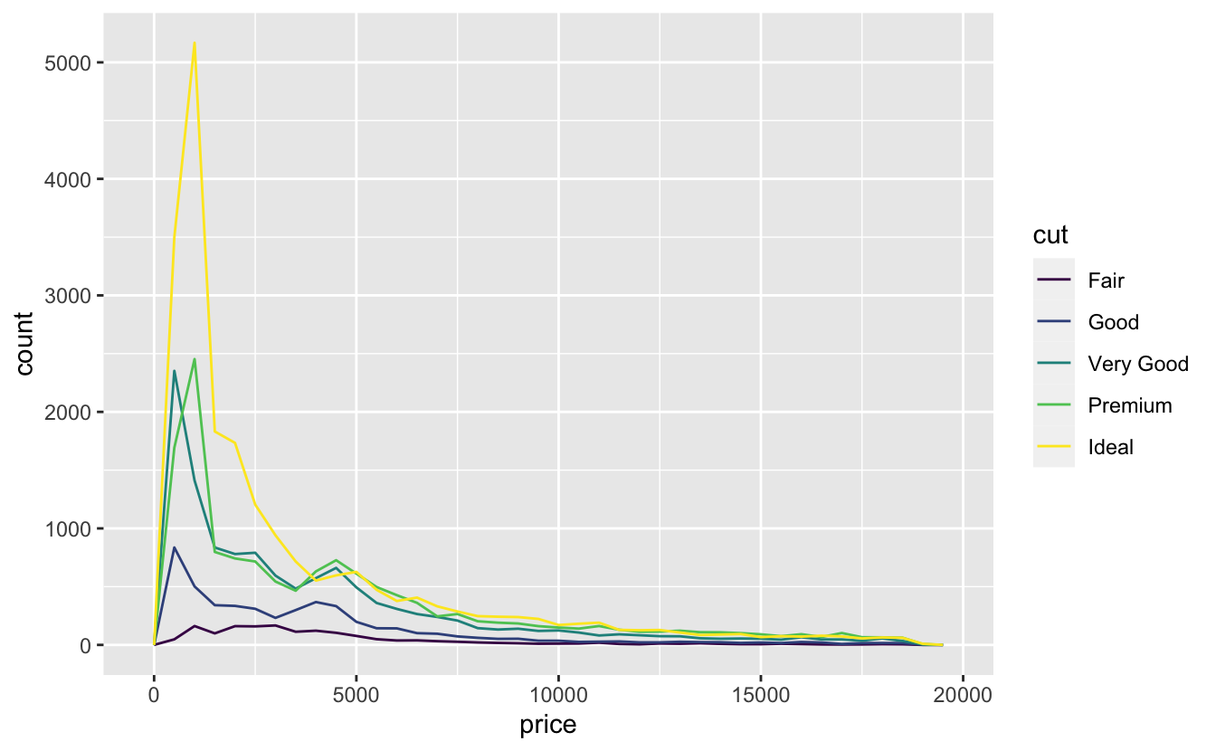
It’s hard to see the difference in distribution because the overall counts differ so much:
ggplot(diamonds) +
  geom_bar(mapping = aes(x = cut))
To make the comparison easier we need to swap what is displayed on the y-axis. Instead of displaying count, we’ll display density, which is the count standardised so that the area under each frequency polygon is one.
ggplot(data = diamonds, mapping = aes(x = price, y = ..density..)) +
  geom_freqpoly(mapping = aes(colour = cut), binwidth = 500)
There’s something rather surprising about this plot - it appears that fair diamonds (the lowest quality) have the highest average price! But maybe that’s because frequency polygons are a little hard to interpret - there’s a lot going on in this plot.
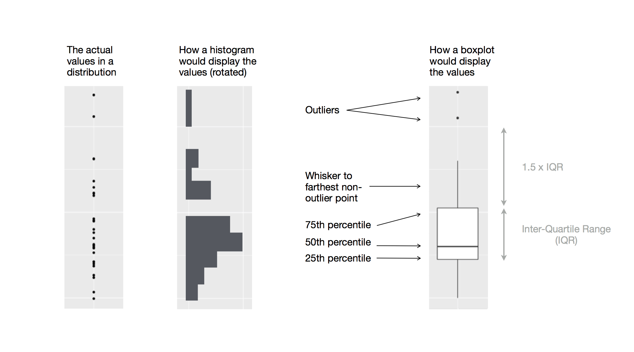
Another alternative to display the distribution of a continuous variable broken down by a categorical variable is the boxplot. A boxplot is a type of visual shorthand for a distribution of values that is popular among statisticians. Each boxplot consists of:
A box that stretches from the 25th percentile of the distribution to the 75th percentile, a distance known as the interquartile range (IQR). In the middle of the box is a line that displays the median, i.e. 50th percentile, of the distribution. These three lines give you a sense of the spread of the distribution and whether or not the distribution is symmetric about the median or skewed to one side.
Visual points that display observations that fall more than 1.5 times the IQR from either edge of the box. These outlying points are unusual so are plotted individually.
A line (or whisker) that extends from each end of the box and goes to the
farthest non-outlier point in the distribution.
Let’s take a look at the distribution of price by cut using geom_boxplot():
ggplot(data = diamonds, mapping = aes(x = cut, y = price)) +
  geom_boxplot()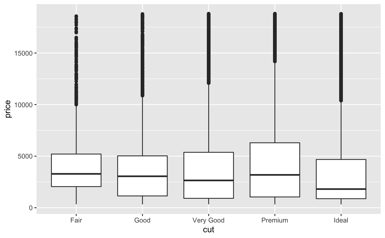
We see much less information about the distribution, but the boxplots are much more compact so we can more easily compare them (and fit more on one plot). It supports the counterintuitive finding that better quality diamonds are cheaper on average! In the exercises, you’ll be challenged to figure out why.
cut is an ordered factor: fair is worse than good, which is worse than very good and so on. Many categorical variables don’t have such an intrinsic order, so you might want to reorder them to make a more informative display. One way to do that is with the reorder() function.
For example, take the class variable in the mpg dataset. You might be interested to know how highway mileage varies across classes:
ggplot(data = mpg, mapping = aes(x = class, y = hwy)) +
  geom_boxplot()
To make the trend easier to see, we can reorder class based on the median value of hwy:
ggplot(data = mpg) +
  geom_boxplot(mapping = aes(x = reorder(class, hwy, FUN = median), y = hwy))
If you have long variable names, geom_boxplot() will work better if you flip it 90°. You can do that with coord_flip().
ggplot(data = mpg) +
  geom_boxplot(mapping = aes(x = reorder(class, hwy, FUN = median), y = hwy)) +
  coord_flip()
To visualise the covariation between categorical variables, you’ll need to count the number of observations for each combination. One way to do that is to rely on the built-in geom_count():
ggplot(data = diamonds) +
  geom_count(mapping = aes(x = cut, y = color))
The size of each circle in the plot displays how many observations occurred at each combination of values. Covariation will appear as a strong correlation between specific x values and specific y values.
Another approach is to compute the count with dplyr:
diamonds %>%
  count(color, cut)
#> # A tibble: 35 x 3
#>   color cut           n
#>   <ord> <ord>     <int>
#> 1 D     Fair        163
#> 2 D     Good        662
#> 3 D     Very Good  1513
#> 4 D     Premium    1603
#> 5 D     Ideal      2834
#> 6 E     Fair        224
#> # … with 29 more rows
Then visualise with geom_tile() and the fill aesthetic:
diamonds %>%
  count(color, cut) %>%
  ggplot(mapping = aes(x = color, y = cut)) +
    geom_tile(mapping = aes(fill = n))
If the categorical variables are unordered, you might want to use the seriation package to simultaneously reorder the rows and columns in order to more clearly reveal interesting patterns. For larger plots, you might want to try the d3heatmap or heatmaply packages, which create interactive plots.
You’ve already seen one great way to visualise the covariation between two continuous variables: draw a scatterplot with geom_point(). You can see covariation as a pattern in the points. For example, you can see an exponential relationship between the carat size and price of a diamond.
ggplot(data = diamonds) +
  geom_point(mapping = aes(x = carat, y = price))
Scatterplots become less useful as the size of your dataset grows, because points begin to overplot, and pile up into areas of uniform black (as above). You’ve already seen one way to fix the problem: using the alpha aesthetic to add transparency.
ggplot(data = diamonds) +
  geom_point(mapping = aes(x = carat, y = price), alpha = 1 / 100)
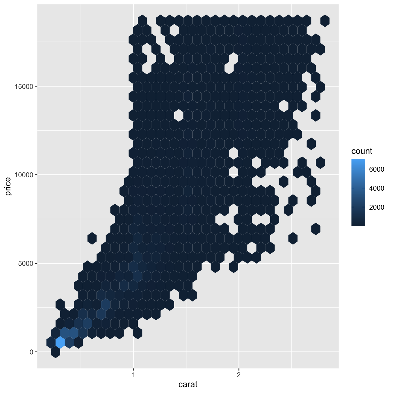
But using transparency can be challenging for very large datasets. Another solution is to use bin. Previously you used geom_histogram() and geom_freqpoly() to bin in one dimension. Now you’ll learn how to use geom_bin2d() and geom_hex() to bin in two dimensions.
geom_bin2d() and geom_hex() divide the coordinate plane into 2d bins and then use a fill color to display how many points fall into each bin. geom_bin2d() creates rectangular bins. geom_hex() creates hexagonal bins. You will need to install the hexbin package to use geom_hex().
ggplot(data = smaller) +
  geom_bin2d(mapping = aes(x = carat, y = price))

# install.packages("hexbin")
ggplot(data = smaller) +
  geom_hex(mapping = aes(x = carat, y = price))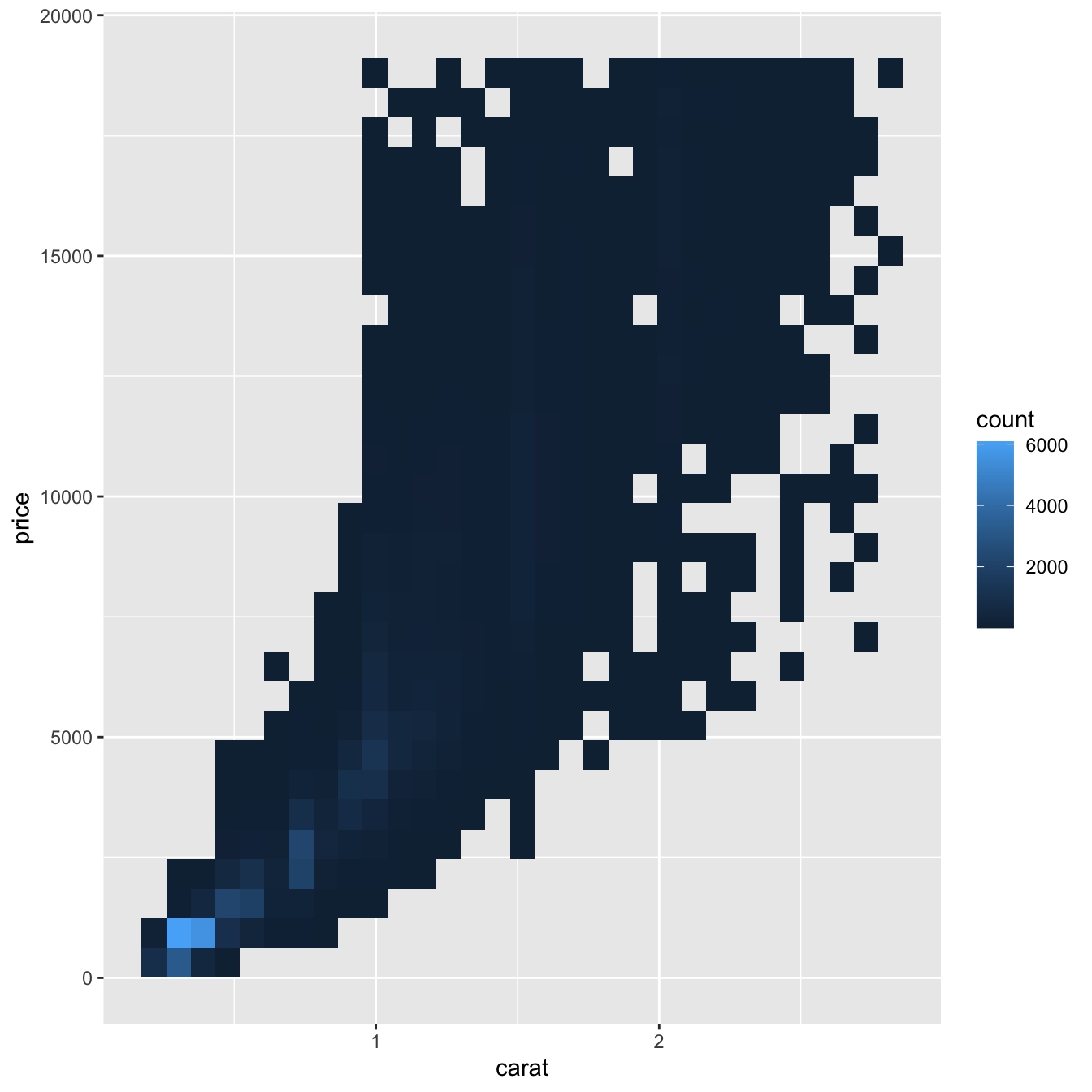
Another option is to bin one continuous variable so it acts like a categorical variable. Then you can use one of the techniques for visualising the combination of a categorical and a continuous variable that you learned about. For example, you could bin carat and then for each group, display a boxplot:
ggplot(data = smaller, mapping = aes(x = carat, y = price)) +
  geom_boxplot(mapping = aes(group = cut_width(carat, 0.1)))
cut_width(x, width), as used above, divides x into bins of width width. By default, boxplots look roughly the same (apart from number of outliers) regardless of how many observations there are, so it’s difficult to tell that each boxplot summarises a different number of points. One way to show that is to make the width of the boxplot proportional to the number of points with varwidth = TRUE.
Another approach is to display approximately the same number of points in each bin. That’s the job of cut_number():
ggplot(data = smaller, mapping = aes(x = carat, y = price)) +
  geom_boxplot(mapping = aes(group = cut_number(carat, 20)))
Instead of summarising the conditional distribution with a boxplot, you could use a frequency polygon. What do you need to consider when using cut_width() vs cut_number()? How does that impact a visualisation of the 2d distribution of carat and price?
Visualise the distribution of carat, partitioned by price.
How does the price distribution of very large diamonds compare to small diamonds? Is it as you expect, or does it surprise you?
Combine two of the techniques you’ve learned to visualise the combined distribution of cut, carat, and price.
Two dimensional plots reveal outliers that are not visible in one dimensional plots. For example, some points in the plot below have an unusual combination of x and y values, which makes the points outliers even though their x and y values appear normal when examined separately.
ggplot(data = diamonds) +
  geom_point(mapping = aes(x = x, y = y)) +
  coord_cartesian(xlim = c(4, 11), ylim = c(4, 11))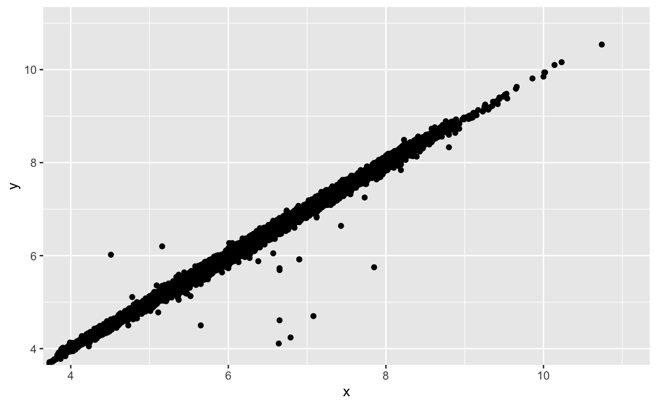
Why is a scatterplot a better display than a binned plot for this case?
Patterns in your data provide clues about relationships. If a systematic relationship exists between two variables it will appear as a pattern in the data. If you spot a pattern, ask yourself:
Could this pattern be due to coincidence (i.e. random chance)?
How can you describe the relationship implied by the pattern?
How strong is the relationship implied by the pattern?
What other variables might affect the relationship?
Does the relationship change if you look at individual subgroups of the data?
A scatterplot of Old Faithful eruption lengths versus the wait time between eruptions shows a pattern: longer wait times are associated with longer eruptions. The scatterplot also displays the two clusters that we noticed above.
ggplot(data = faithful) +
  geom_point(mapping = aes(x = eruptions, y = waiting))
Patterns provide one of the most useful tools for data scientists because they reveal covariation. If you think of variation as a phenomenon that creates uncertainty, covariation is a phenomenon that reduces it. If two variables covary, you can use the values of one variable to make better predictions about the values of the second. If the covariation is due to a causal relationship (a special case), then you can use the value of one variable to control the value of the second.
Models are a tool for extracting patterns out of data. For example, consider the diamonds data. It’s hard to understand the relationship between cut and price, because cut and carat, and carat and price are tightly related. It’s possible to use a model to remove the very strong relationship between price and carat so we can explore the subtleties that remain. The following code fits a model that predicts price from carat and then computes the residuals (the difference between the predicted value and the actual value). The residuals give us a view of the price of the diamond, once the effect of carat has been removed.
library(modelr)

mod <- lm(log(price) ~ log(carat), data = diamonds)

diamonds2 <- diamonds %>%
  add_residuals(mod) %>%
  mutate(resid = exp(resid))

ggplot(data = diamonds2) +
  geom_point(mapping = aes(x = carat, y = resid))
Once you’ve removed the strong relationship between carat and price, you can see what you expect in the relationship between cut and price: relative to their size, better quality diamonds are more expensive.
ggplot(data = diamonds2) +
  geom_boxplot(mapping = aes(x = cut, y = resid))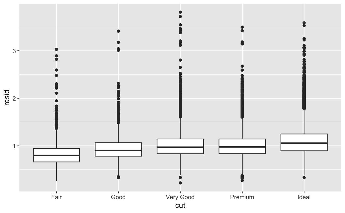
You’ll learn how models, and the modelr package, work in the final part of the book, model. We’re saving modelling for later because understanding what models are and how they work is easiest once you have tools of data wrangling and programming in hand.
The goal of a model is to provide a simple low-dimensional summary of a dataset. In the context of this book we’re going to use models to partition data into patterns and residuals. Strong patterns will hide subtler trends, so we’ll use models to help peel back layers of structure as we explore a dataset.
However, before we can start using models on interesting, real, datasets, you need to understand the basics of how models work. For that reason, this chapter of the book is unique because it uses only simulated datasets. These datasets are very simple, and not at all interesting, but they will help you understand the essence of modelling before you apply the same techniques to real data in the next chapter.
There are two parts to a model:
First, you define a family of models that express a precise, but generic, pattern that you want to capture. For example, the pattern might be a straight line, or a quadratic curve. You will express the model family as an equation like y = a_1 * x + a_2 or y = a_1 * x ^ a_2. Here, x and y are known variables from your data, and a_1 and a_2 are parameters that can vary to capture different patterns.
Next, you generate a fitted model by finding the model from the family that is the closest to your data. This takes the generic model family and makes it specific, like y = 3 * x + 7 or y = 9 * x ^ 2.
It’s important to understand that a fitted model is just the closest model from a family of models. That implies that you have the “best” model (according to some criteria); it doesn’t imply that you have a good model and it certainly doesn’t imply that the model is “true”. George Box puts this well in his famous aphorism:
All models are wrong, but some are useful.
It’s worth reading the fuller context of the quote:
Now it would be very remarkable if any system existing in the real world could be exactly represented by any simple model. However, cunningly chosen parsimonious models often do provide remarkably useful approximations. For example, the law PV = RT relating pressure P, volume V and temperature T of an “ideal” gas via a constant R is not exactly true for any real gas, but it frequently provides a useful approximation and furthermore its structure is informative since it springs from a physical view of the behavior of gas molecules.
For such a model there is no need to ask the question “Is the model true?”. If “truth” is to be the “whole truth” the answer must be “No”. The only question of interest is “Is the model illuminating and useful?”.
The goal of a model is not to uncover truth, but to discover a simple approximation that is still useful.
Lets take a look at the simulated dataset sim1, included with the modelr package. It contains two continuous variables, x and y. Let’s plot them to see how they’re related:
ggplot(sim1, aes(x, y)) +
  geom_point()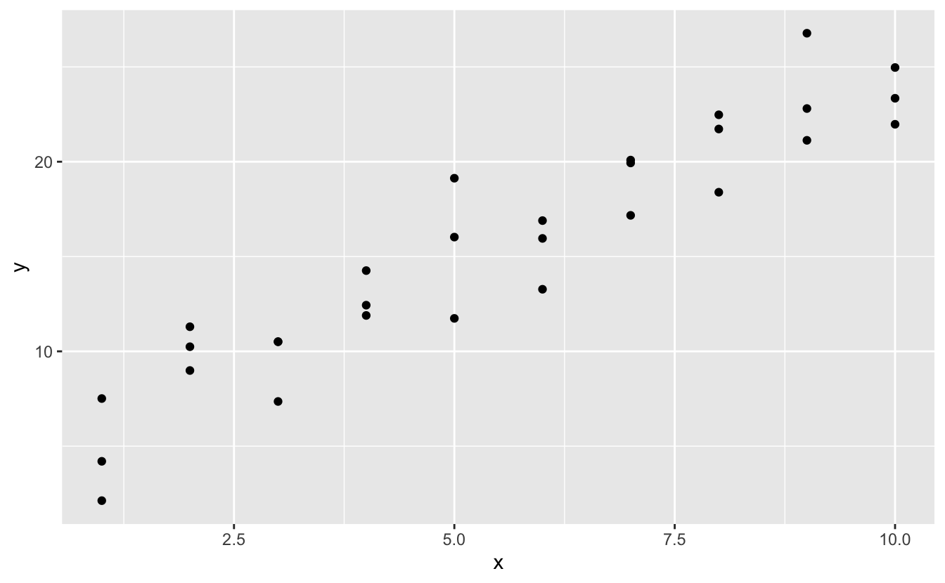
You can see a strong pattern in the data. Let’s use a model to capture that pattern and make it explicit. It’s our job to supply the basic form of the model. In this case, the relationship looks linear, i.e. y = a_0 + a_1 * x. Let’s start by getting a feel for what models from that family look like by randomly generating a few and overlaying them on the data. For this simple case, we can use geom_abline() which takes a slope and intercept as parameters. Later on we’ll learn more general techniques that work with any model.
models <- tibble(
  a1 = runif(250, -20, 40),
  a2 = runif(250, -5, 5)
)

ggplot(sim1, aes(x, y)) +
  geom_abline(aes(intercept = a1, slope = a2), data = models, alpha = 1/4) +
geom_point() 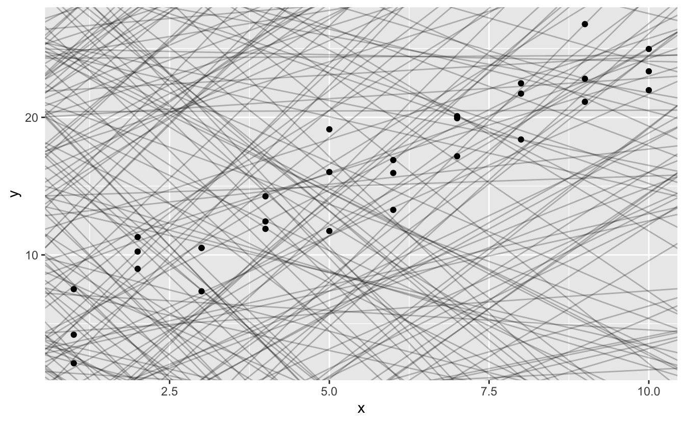
There are 250 models on this plot, but a lot are really bad! We need to find the good models by making precise our intuition that a good model is “close” to the data. We need a way to quantify the distance between the data and a model. Then we can fit the model by finding the value of a_0 and a_1 that generate the model with the smallest distance from this data.
One easy place to start is to find the vertical distance between each point and the model, as in the following diagram. (Note that I’ve shifted the x values slightly so you can see the individual distances.)
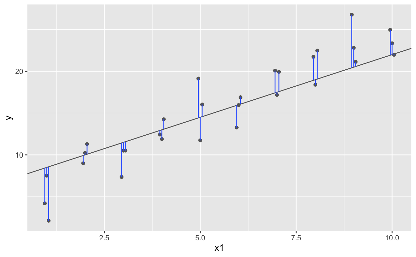
This distance is just the difference between the y value given by the model (the prediction), and the actual y value in the data (the response).
To compute this distance, we first turn our model family into an R function. This takes the model parameters and the data as inputs, and gives values predicted by the model as output:
model1 <- function(a, data) {
  a[1] + data$x * a[2]
}
model1(c(7, 1.5), sim1)
#>  [1]  8.5  8.5  8.5 10.0 10.0 10.0 11.5 11.5 11.5 13.0 13.0 13.0 14.5 14.5 14.5
#> [16] 16.0 16.0 16.0 17.5 17.5 17.5 19.0 19.0 19.0 20.5 20.5 20.5 22.0 22.0 22.0
Next, we need some way to compute an overall distance between the predicted and actual values. In other words, the plot above shows 30 distances: how do we collapse that into a single number?
One common way to do this in statistics to use the “root-mean-squared deviation”. We compute the difference between actual and predicted, square them, average them, and the take the square root. This distance has lots of appealing mathematical properties, which we’re not going to talk about here. You’ll just have to take my word for it!
measure_distance <- function(mod, data) {
  diff <- data$y - model1(mod, data)
  sqrt(mean(diff ^ 2))
}
measure_distance(c(7, 1.5), sim1)
#> [1] 2.665212
Now we can use purrr to compute the distance for all the models defined above. We need a helper function because our distance function expects the model as a numeric vector of length 2.
sim1_dist <- function(a1, a2) {
measure_distance(c(a1, a2), sim1)
}
models <- models %>%
mutate(dist = purrr::map2_dbl(a1, a2, sim1_dist))
models
#> # A tibble: 250 x 3
#> a1 a2 dist
#> <dbl> <dbl> <dbl>
#> 1 -15.2 0.0889 30.8
#> 2 30.1 -0.827 13.2
#> 3 16.0 2.27 13.2
#> 4 -10.6 1.38 18.7
#> 5 -19.6 -1.04 41.8
#> 6 7.98 4.59 19.3
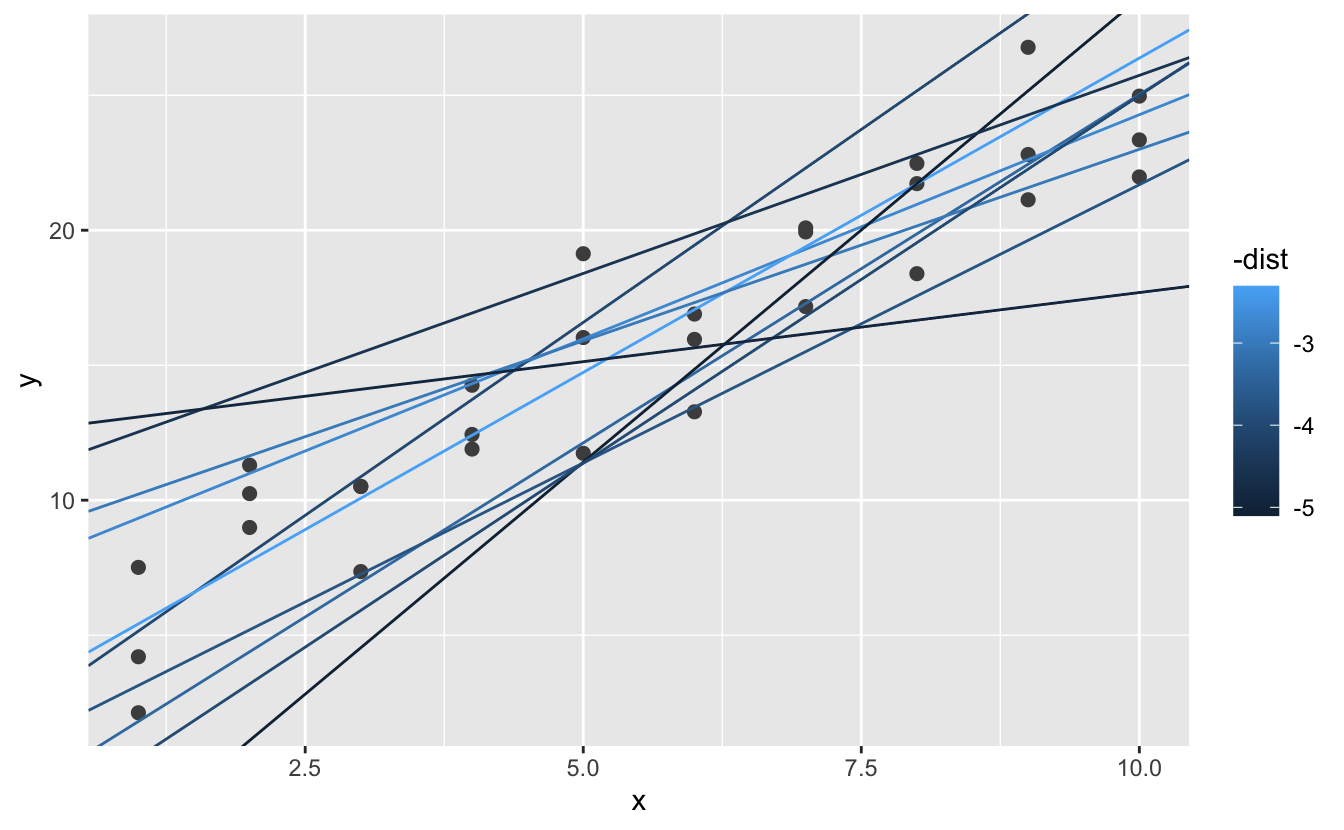
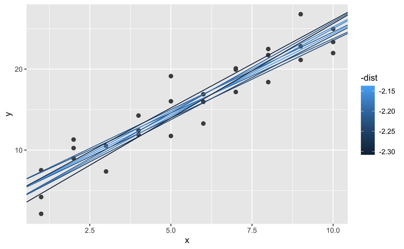
#> # … with 244 more rowsNext, let’s overlay the 10 best models on to the data. I’ve coloured the models by -dist: this is an easy way to make sure that the best models (i.e. the ones with the smallest distance) get the brighest colours.
ggplot(sim1, aes(x, y)) +
  geom_point(size = 2, colour = "grey30") +
  geom_abline(
    aes(intercept = a1, slope = a2, colour = -dist),
    data = filter(models, rank(dist) <= 10)
  )
We can also think about these models as observations, and visualising with a scatterplot of a1 vs a2, again coloured by -dist. We can no longer directly see how the model compares to the data, but we can see many models at once. Again, I’ve highlighted the 10 best models, this time by drawing red circles underneath them.
ggplot(models, aes(a1, a2)) +
  geom_point(data = filter(models, rank(dist) <= 10), size = 4, colour = "red") +
  geom_point(aes(colour = -dist))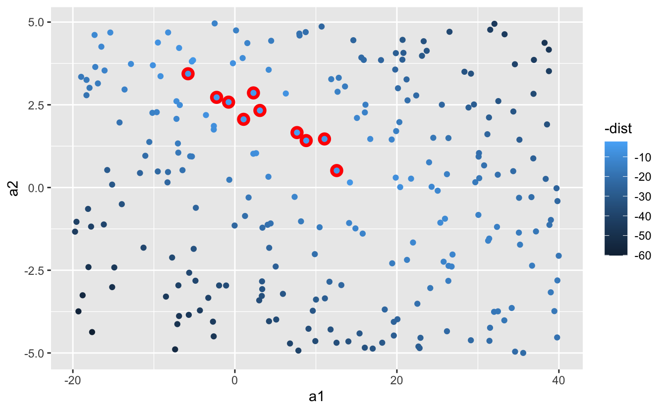
Instead of trying lots of random models, we could be more systematic and generate an evenly spaced grid of points (this is called a grid search). I picked the parameters of the grid roughly by looking at where the best models were in the plot above.
grid <- expand.grid(
  a1 = seq(-5, 20, length = 25),
  a2 = seq(1, 3, length = 25)
  ) %>%
  mutate(dist = purrr::map2_dbl(a1, a2, sim1_dist))

grid %>%
  ggplot(aes(a1, a2)) +
  geom_point(data = filter(grid, rank(dist) <= 10), size = 4, colour = "red") +
geom_point(aes(colour = -dist)) 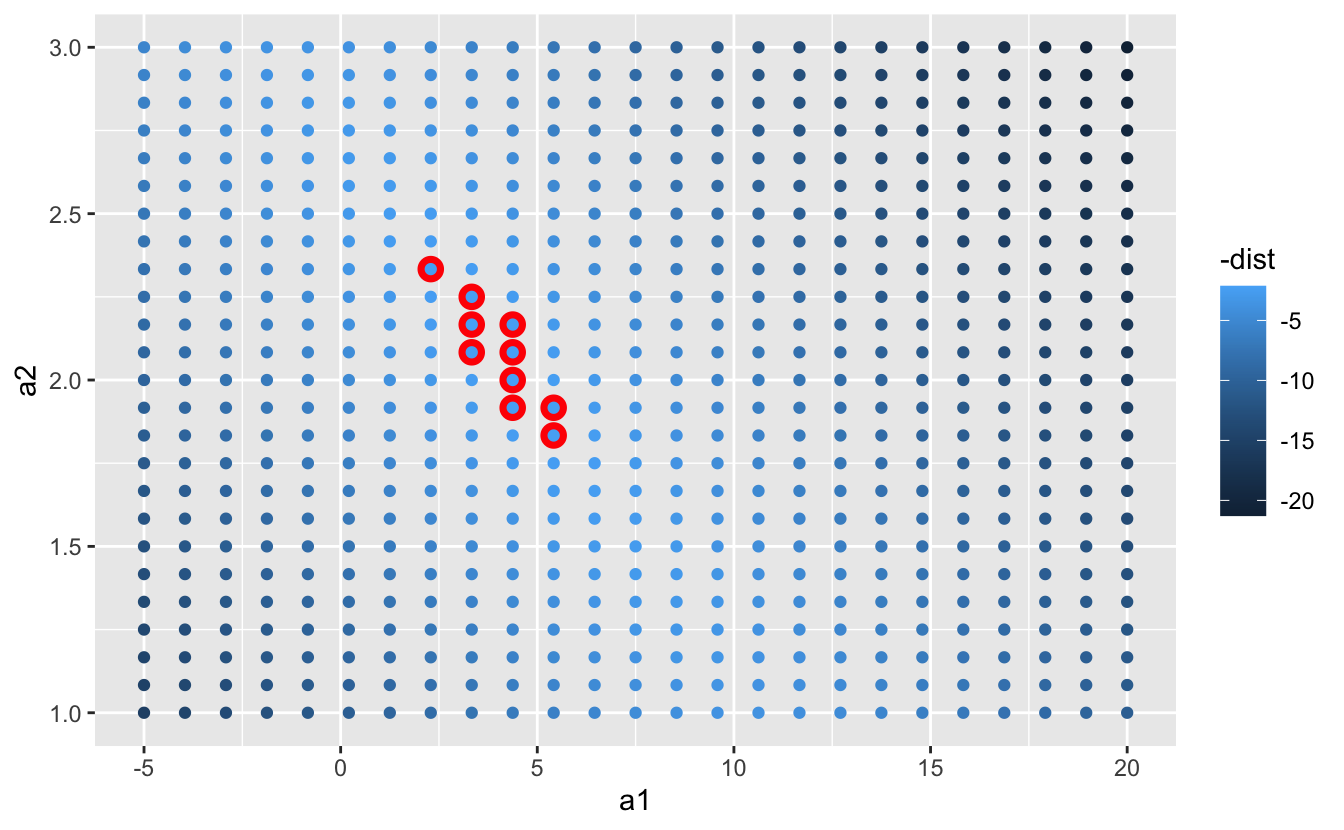
When you overlay the best 10 models back on the original data, they all look pretty good:
ggplot(sim1, aes(x, y)) +
  geom_point(size = 2, colour = "grey30") +
  geom_abline(
    aes(intercept = a1, slope = a2, colour = -dist),
    data = filter(grid, rank(dist) <= 10)
  )
You could imagine iteratively making the grid finer and finer until you narrowed in on the best model. But there’s a better way to tackle that problem: a numerical minimisation tool called Newton-Raphson search. The intuition of Newton-Raphson is pretty simple: you pick a starting point and look around for the steepest slope. You then ski down that slope a little way, and then repeat again and again, until you can’t go any lower. In R, we can do that with optim():
best <- optim(c(0, 0), measure_distance, data = sim1)
best$par
#> [1] 4.222248 2.051204

ggplot(sim1, aes(x, y)) +
  geom_point(size = 2, colour = "grey30") +
  geom_abline(intercept = best$par[1], slope = best$par[2])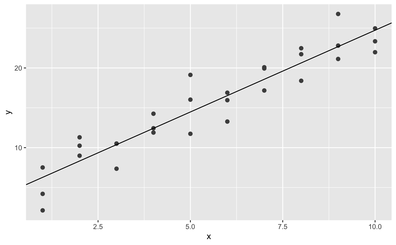
Don’t worry too much about the details of how optim() works. It’s the intuition that’s important here. If you have a function that defines the distance between a model and a dataset, an algorithm that can minimise that distance by modifying the parameters of the model, you can find the best model. The neat thing about this approach is that it will work for any family of models that you can write an equation for.
There’s one more approach that we can use for this model, because it’s a special case of a broader family: linear models. A linear model has the general form y = a_1 + a_2 * x_1 + a_3 * x_2 + ... + a_n * x_(n - 1). So this simple model is equivalent to a general linear model where n is 2 and x_1 is x. R has a tool specifically designed for fitting linear models called lm(). lm() has a special way to specify the model family: formulas. Formulas look like y ~ x, which lm() will translate to a function like y = a_1 + a_2 * x. We can fit the model and look at the output:
These are exactly the same values we got with optim()! Behind the scenes lm() doesn’t use optim() but instead takes advantage of the mathematical structure of linear models. Using some connections between geometry, calculus, and linear algebra, lm() actually finds the closest model in a single step, using a sophisticated algorithm. This approach is both faster, and guarantees that there is a global minimum.
For simple models, like the one above, you can figure out what pattern the model captures by carefully studying the model family and the fitted coefficients. And if you ever take a statistics course on modelling, you’re likely to spend a lot of time doing just that. Here, however, we’re going to take a different tack. We’re going to focus on understanding a model by looking at its predictions. This has a big advantage: every type of predictive model makes predictions (otherwise what use would it be?) so we can use the same set of techniques to understand any type of predictive model.
It’s also useful to see what the model doesn’t capture, the so-called residuals which are left after subtracting the predictions from the data. Residuals are powerful because they allow us to use models to remove striking patterns so we can study the subtler trends that remain.
To visualise the predictions from a model, we start by generating an evenly spaced grid of values that covers the region where our data lies. The easiest way to do that is to use modelr::data_grid(). Its first argument is a data frame, and for each subsequent argument it finds the unique variables and then generates all combinations:
grid <- sim1 %>%
  data_grid(x)
grid
#> # A tibble: 10 x 1
#>       x
#>   <int>
#> 1     1
#> 2     2
#> 3     3
#> 4     4
#> 5     5
#> 6     6
#> # … with 4 more rows
(This will get more interesting when we start to add more variables to our model.)
Next we add predictions. We’ll use modelr::add_predictions() which takes a data frame and a model. It adds the predictions from the model to a new column in the data frame:
grid <- grid %>%
  add_predictions(sim1_mod)
grid
#> # A tibble: 10 x 2
#>       x  pred
#>   <int> <dbl>
#> 1     1  6.27
#> 2     2  8.32
#> 3     3 10.4
#> 4     4 12.4
#> 5     5 14.5
#> 6     6 16.5
#> # … with 4 more rows
(You can also use this function to add predictions to your original dataset.)
Next, we plot the predictions. You might wonder about all this extra work compared to just using geom_abline(). But the advantage of this approach is that it will work with any model in R, from the simplest to the most complex. You’re only limited by your visualisation skills. For more ideas about how to visualise more complex model types, you might try http://vita.had.co.nz/papers/model-vis.html.
ggplot(sim1, aes(x)) +
  geom_point(aes(y = y)) +
  geom_line(aes(y = pred), data = grid, colour = "red", size = 1)
The flip-side of predictions are residuals. The predictions tells you the pattern that the model has captured, and the residuals tell you what the model has missed. The residuals are just the distances between the observed and predicted values that we computed above.
We add residuals to the data with add_residuals(), which works much like add_predictions(). Note, however, that we use the original dataset, not a manufactured grid. This is because to compute residuals we need actual y values.
sim1 <- sim1 %>%
  add_residuals(sim1_mod)
sim1
#> # A tibble: 30 x 3
#>       x     y  resid
#>   <int> <dbl>  <dbl>
#> 1     1  4.20 -2.07
#> 2     1  7.51  1.24
#> 3     1  2.13 -4.15
#> 4     2  8.99  0.665
#> 5     2 10.2   1.92
#> 6     2 11.3   2.97
#> # … with 24 more rows
There are a few different ways to understand what the residuals tell us about the model. One way is to simply draw a frequency polygon to help us understand the spread of the residuals:
ggplot(sim1, aes(resid)) +
  geom_freqpoly(binwidth = 0.5)
This helps you calibrate the quality of the model: how far away are the predictions from the observed values? Note that the average of the residual will always be 0.
You’ll often want to recreate plots using the residuals instead of the original predictor. You’ll see a lot of that in the next chapter.
ggplot(sim1, aes(x, resid)) +
  geom_ref_line(h = 0) +
geom_point() 
This looks like random noise, suggesting that our model has done a good job of capturing the patterns in the dataset.
Instead of using lm() to fit a straight line, you can use loess() to fit a smooth curve. Repeat the process of model fitting, grid generation, predictions, and visualisation on sim1 using loess() instead of lm(). How does the result compare to geom_smooth()?
add_predictions() is paired with gather_predictions() and spread_predictions(). How do these three functions differ?
What does geom_ref_line() do? What package does it come from? Why is displaying a reference line in plots showing residuals useful and important?
Why might you want to look at a frequency polygon of absolute residuals? What are the pros and cons compared to looking at the raw residuals?
You’ve seen formulas before when using facet_wrap() and facet_grid(). In R, formulas provide a general way of getting “special behaviour”. Rather than evaluating the values of the variables right away, they capture them so they can be interpreted by the function.
The majority of modelling functions in R use a standard conversion from formulas to functions. You’ve seen one simple conversion already: y ~ x is translated to y = a_1 + a_2 * x. If you want to see what R actually does, you can use the model_matrix() function. It takes a data frame and a formula and returns a tibble that defines the model equation: each column in the output is associated with one coefficient in the model, the function is always y = a_1 * out1 + a_2 * out_2. For the simplest case of y ~ x1 this shows us something interesting:
df <- tribble(
  ~y, ~x1, ~x2,
  4, 2, 5,
  5, 1, 6
)
model_matrix(df, y ~ x1)
#> # A tibble: 2 x 2
#>   `(Intercept)`    x1
#>           <dbl> <dbl>
#> 1             1     2
#> 2             1     1
The way that R adds the intercept to the model is just by having a column that is full of ones. By default, R will always add this column. If you don’t want, you need to explicitly drop it with -1:
model_matrix(df, y ~ x1 - 1)
#> # A tibble: 2 x 1
#>      x1
#>   <dbl>
#> 1     2
#> 2     1
The model matrix grows in an unsurprising way when you add more variables to the the model:
model_matrix(df, y ~ x1 + x2)
#> # A tibble: 2 x 3
#>   `(Intercept)`    x1    x2
#>           <dbl> <dbl> <dbl>
#> 1             1     2     5
#> 2             1     1     6
This formula notation is sometimes called “Wilkinson-Rogers notation”, and was initially described in Symbolic Description of Factorial Models for Analysis of Variance, by G. N. Wilkinson and C. E. Rogers https://www.jstor.org/stable/2346786. It’s worth digging up and reading the original paper if you’d like to understand the full details of the modelling algebra.
The following sections expand on how this formula notation works for categorical variables, interactions, and transformation.
Generating a function from a formula is straight forward when the predictor is continuous, but things get a bit more complicated when the predictor is categorical. Imagine you have a formula like y ~ sex, where sex could either be male or female. It doesn’t make sense to convert that to a formula like y = x_0 + x_1 * sex because sex isn’t a number - you can’t multiply it! Instead what R does is convert it to y = x_0 + x_1 * sex_male where sex_male is one if sex is male and zero otherwise:
df <- tribble(
  ~ sex, ~ response,
  "male", 1,
  "female", 2,
  "male", 1
)
model_matrix(df, response ~ sex)
#> # A tibble: 3 x 2
#>   `(Intercept)` sexmale
#>           <dbl>   <dbl>
#> 1             1       1
#> 2             1       0
#> 3             1       1
You might wonder why R also doesn’t create a sexfemale column. The problem is that would create a column that is perfectly predictable based on the other columns (i.e. sexfemale = 1 - sexmale). Unfortunately the exact details of why this is a problem is beyond the scope of this book, but basically it creates a model family that is too flexible, and will have infinitely many models that are equally close to the data.
Fortunately, however, if you focus on visualising predictions you don’t need to worry about the exact parameterisation. Let’s look at some data and models to make that concrete. Here’s the sim2 dataset from modelr:
ggplot(sim2) +
  geom_point(aes(x, y))
We can fit a model to it, and generate predictions:
mod2 <- lm(y ~ x, data = sim2)

grid <- sim2 %>%
  data_grid(x) %>%
  add_predictions(mod2)
grid
#> # A tibble: 4 x 2
#>   x      pred
#>   <chr> <dbl>
#> 1 a      1.15
#> 2 b      8.12
#> 3 c      6.13
#> 4 d      1.91
Effectively, a model with a categorical x will predict the mean value for each category. (Why? Because the mean minimises the root-mean-squared distance.) That’s easy to see if we overlay the predictions on top of the original data:
ggplot(sim2, aes(x)) +
  geom_point(aes(y = y)) +
  geom_point(data = grid, aes(y = pred), colour = "red", size = 4)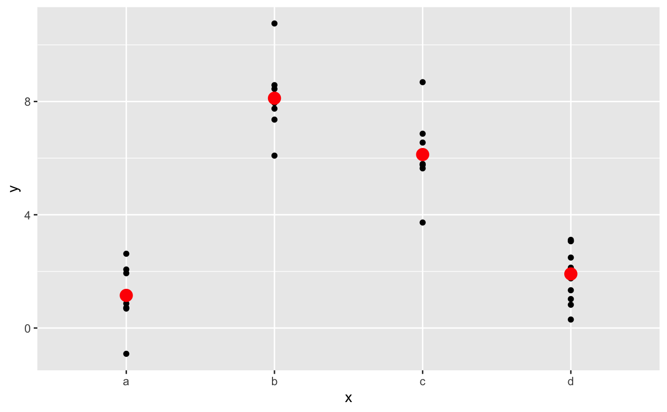
You can’t make predictions about levels that you didn’t observe. Sometimes you’ll do this by accident so it’s good to recognise this error message:
tibble(x = "e") %>%
  add_predictions(mod2)
#> Error in model.frame.default(Terms, newdata, na.action = na.action, xlev = object$xlevels): factor x has new level eWhat happens when you combine a continuous and a categorical variable? sim3 contains a categorical predictor and a continuous predictor. We can visualise it with a simple plot:
ggplot(sim3, aes(x1, y)) +
  geom_point(aes(colour = x2))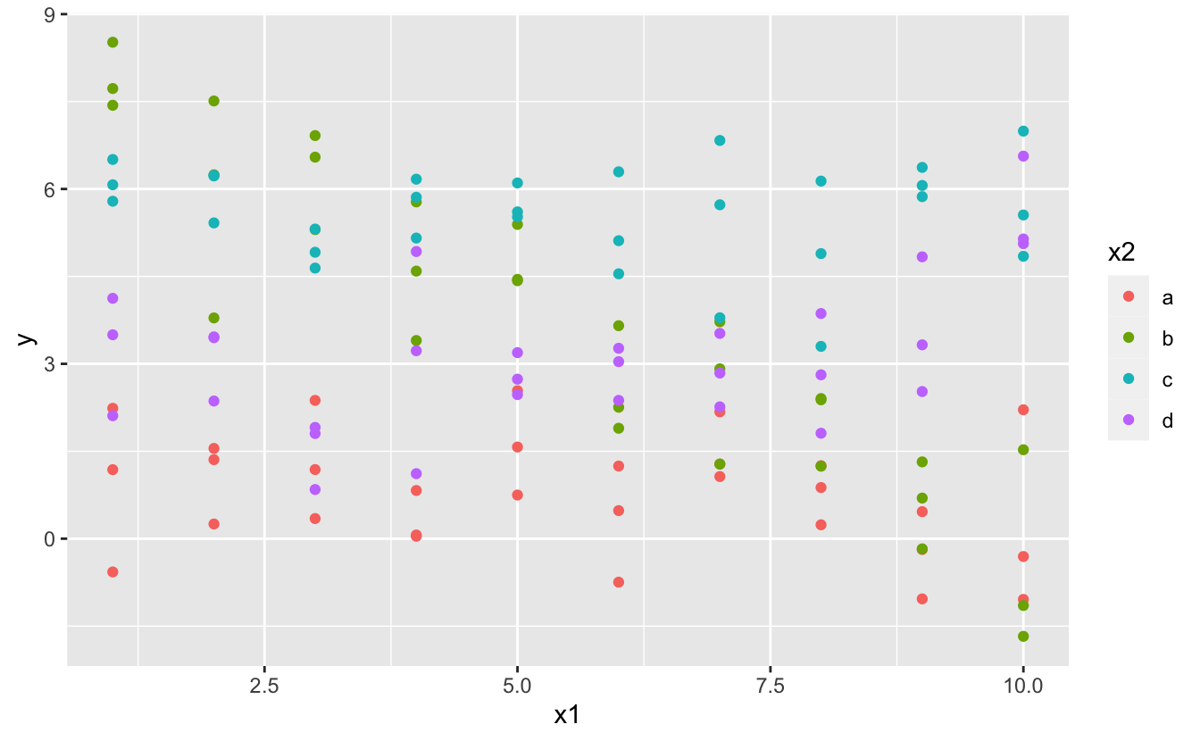
There are two possible models you could fit to this data:
When you add variables with +, the model will estimate each effect independent of all the others. It’s possible to fit the so-called interaction by using *. For example, y ~ x1 * x2 is translated to y = a_0 + a_1 * x1 + a_2 * x2 + a_12 * x1 * x2. Note that whenever you use *, both the interaction and the individual components are included in the model.
To visualise these models we need two new tricks:
We have two predictors, so we need to give data_grid() both variables. It finds all the unique values of x1 and x2 and then generates all combinations.
To generate predictions from both models simultaneously, we can use gather_predictions() which adds each prediction as a row. The complement of gather_predictions() is spread_predictions() which adds each prediction to a new column.
Together this gives us:
grid <- sim3 %>%
  data_grid(x1, x2) %>%
  gather_predictions(mod1, mod2)
grid
#> # A tibble: 80 x 4
#>   model    x1 x2     pred
#>   <chr> <int> <fct> <dbl>
#> 1 mod1      1 a      1.67
#> 2 mod1      1 b      4.56
#> 3 mod1      1 c      6.48
#> 4 mod1      1 d      4.03
#> 5 mod1      2 a      1.48
#> 6 mod1      2 b      4.37
#> # … with 74 more rows
We can visualise the results for both models on one plot using facetting:
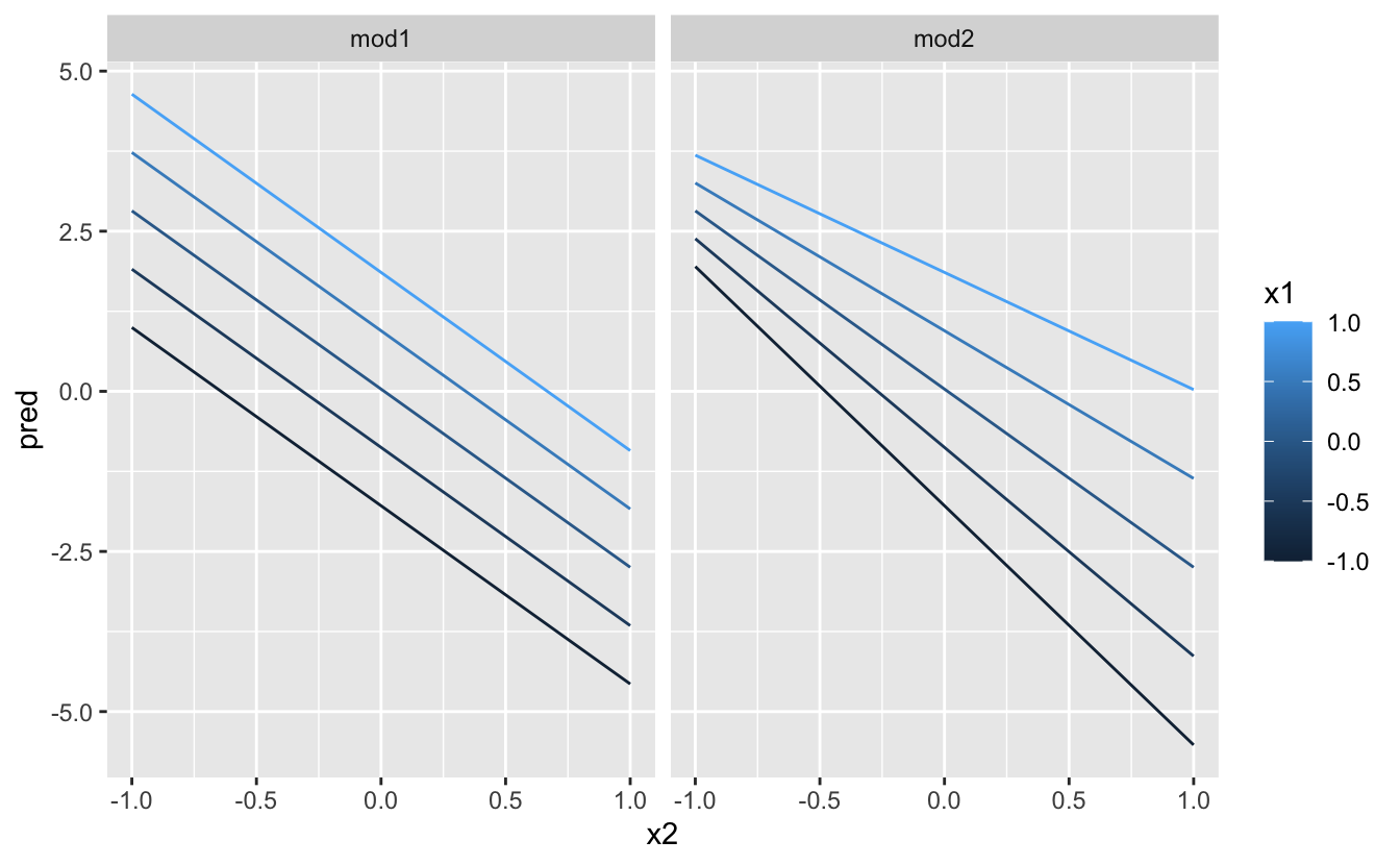
ggplot(sim3, aes(x1, y, colour = x2)) +
  geom_point() +
  geom_line(data = grid, aes(y = pred)) +
  facet_wrap(~ model)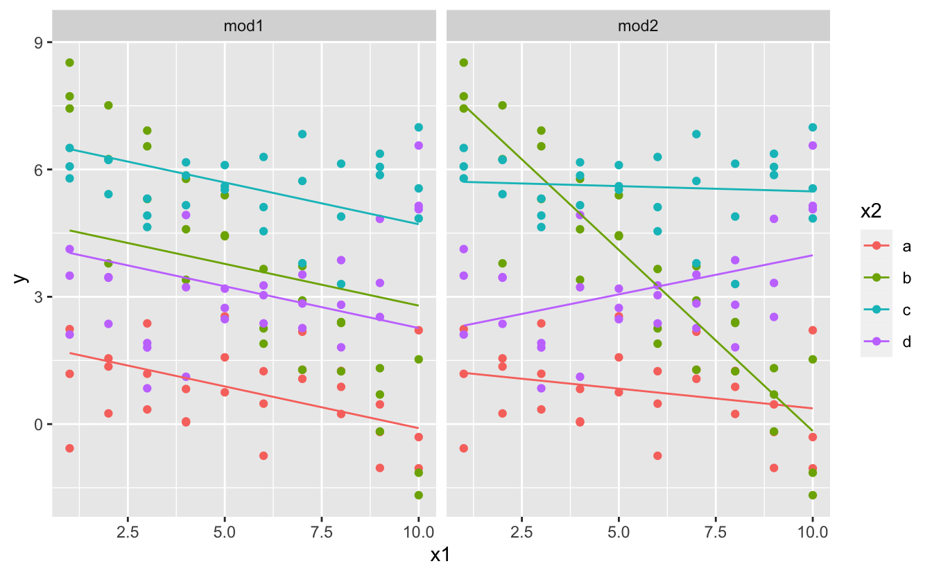
Note that the model that uses + has the same slope for each line, but different intercepts. The model that uses * has a different slope and intercept for each line.
Which model is better for this data? We can take look at the residuals. Here I’ve facetted by both model and x2 because it makes it easier to see the pattern within each group.
sim3 <- sim3 %>%
  gather_residuals(mod1, mod2)

ggplot(sim3, aes(x1, resid, colour = x2)) +
  geom_point() +
  facet_grid(model ~ x2)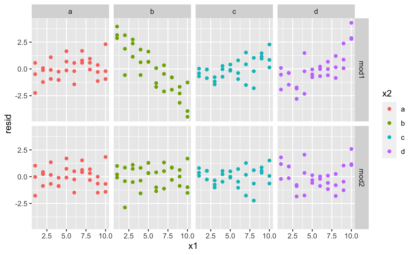
There is little obvious pattern in the residuals for mod2. The residuals for mod1 show that the model has clearly missed some pattern in b, and less so, but still present is pattern in c, and d. You might wonder if there’s a precise way to tell which of mod1 or mod2 is better. There is, but it requires a lot of mathematical background, and we don’t really care. Here, we’re interested in a qualitative assessment of whether or not the model has captured the pattern that we’re interested in.
Let’s take a look at the equivalent model for two continuous variables. Initially things proceed almost identically to the previous example:
mod1 <- lm(y ~ x1 + x2, data = sim4)
mod2 <- lm(y ~ x1 * x2, data = sim4)

grid <- sim4 %>%
  data_grid(
    x1 = seq_range(x1, 5),
    x2 = seq_range(x2, 5)
  ) %>%
  gather_predictions(mod1, mod2)
grid
#> # A tibble: 50 x 4
#>   model    x1    x2   pred
#>   <chr> <dbl> <dbl>  <dbl>
#> 1 mod1   -1    -1    0.996
#> 2 mod1   -1    -0.5 -0.395
#> 3 mod1   -1     0   -1.79
#> 4 mod1   -1     0.5 -3.18
#> 5 mod1   -1     1   -4.57
#> 6 mod1   -0.5  -1    1.91
#> # … with 44 more rows
Note my use of seq_range() inside data_grid(). Instead of using every unique value of x, I’m going to use a regularly spaced grid of five values between the minimum and maximum numbers. It’s probably not super important here, but it’s a useful technique in general. There are two other useful arguments to seq_range():
pretty = TRUE will generate a “pretty” sequence, i.e. something that looks nice to the human eye. This is useful if you want to produce tables of output:
trim = 0.1 will trim off 10% of the tail values. This is useful if the variables have a long tailed distribution and you want to focus on generating values near the center:
x1 <- rcauchy(100)
seq_range(x1, n = 5)
#> [1] -115.86934  -83.52130  -51.17325  -18.82520   13.52284
seq_range(x1, n = 5, trim = 0.10)
#> [1] -13.841101  -8.709812  -3.578522   1.552767   6.684057
seq_range(x1, n = 5, trim = 0.25)
#> [1] -2.17345439 -1.05938856  0.05467728  1.16874312  2.28280896
seq_range(x1, n = 5, trim = 0.50)
#> [1] -0.7249565 -0.2677888  0.1893788  0.6465465  1.1037141
expand = 0.1 is in some sense the opposite of trim() it expands the range by 10%.
Next let’s try and visualise that model. We have two continuous predictors, so you can imagine the model like a 3d surface. We could display that using geom_tile():
ggplot(grid, aes(x1, x2)) +
  geom_tile(aes(fill = pred)) +
  facet_wrap(~ model)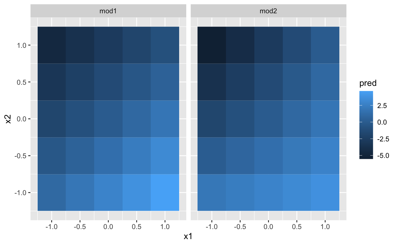
That doesn’t suggest that the models are very different! But that’s partly an illusion: our eyes and brains are not very good at accurately comparing shades of colour. Instead of looking at the surface from the top, we could look at it from either side, showing multiple slices:
ggplot(grid, aes(x1, pred, colour = x2, group = x2)) +
  geom_line() +
  facet_wrap(~ model)
ggplot(grid, aes(x2, pred, colour = x1, group = x1)) +
  geom_line() +
  facet_wrap(~ model)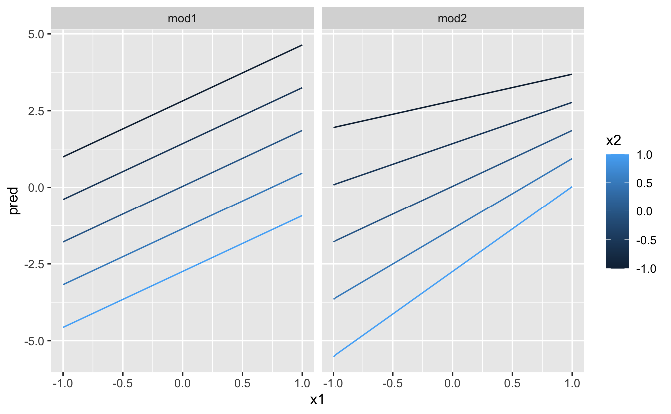
This shows you that interaction between two continuous variables works basically the same way as for a categorical and continuous variable. An interaction says that there’s not a fixed offset: you need to consider both values of x1 and x2 simultaneously in order to predict y.
You can see that even with just two continuous variables, coming up with good visualisations are hard. But that’s reasonable: you shouldn’t expect it will be easy to understand how three or more variables simultaneously interact! But again, we’re saved a little because we’re using models for exploration, and you can gradually build up your model over time. The model doesn’t have to be perfect, it just has to help you reveal a little more about your data.
I spent some time looking at the residuals to see if I could figure if mod2 did better than mod1. I think it does, but it’s pretty subtle. You’ll have a chance to work on it in the exercises.
You can also perform transformations inside the model formula. For example, log(y) ~ sqrt(x1) + x2 is transformed to log(y) = a_1 + a_2 * sqrt(x1) + a_3 * x2. If your transformation involves +, *, ^, or -, you’ll need to wrap it in I() so R doesn’t treat it like part of the model specification. For example, y ~ x + I(x ^ 2) is translated to y = a_1 + a_2 * x + a_3 * x^2. If you forget the I() and specify y ~ x ^ 2 + x, R will compute y ~ x * x + x. x * x means the interaction of x with itself, which is the same as x. R automatically drops redundant variables so x + x become x, meaning that y ~ x ^ 2 + x specifies the function y = a_1 + a_2 * x. That’s probably not what you intended!
Again, if you get confused about what your model is doing, you can always use model_matrix() to see exactly what equation lm() is fitting:
df <- tribble(
  ~y, ~x,
   1,  1,
   2,  2,
   3,  3
)
model_matrix(df, y ~ x^2 + x)
#> # A tibble: 3 x 2
#>   `(Intercept)`     x
#>           <dbl> <dbl>
#> 1             1     1
#> 2             1     2
#> 3             1     3
model_matrix(df, y ~ I(x^2) + x)
#> # A tibble: 3 x 3
#>   `(Intercept)` `I(x^2)`     x
#>           <dbl>    <dbl> <dbl>
#> 1             1        1     1
#> 2             1        4     2
#> 3             1        9     3
Transformations are useful because you can use them to approximate non-linear functions. If you’ve taken a calculus class, you may have heard of Taylor’s theorem which says you can approximate any smooth function with an infinite sum of polynomials. That means you can use a polynomial function to get arbitrarily close to a smooth function by fitting an equation like y = a_1 + a_2 * x + a_3 * x^2 + a_4 * x ^ 3. Typing that sequence by hand is tedious, so R provides a helper function: poly():
model_matrix(df, y ~ poly(x, 2))
#> # A tibble: 3 x 3
#>   `(Intercept)` `poly(x, 2)1` `poly(x, 2)2`
#>           <dbl>         <dbl>         <dbl>
#> 1             1     -7.07e- 1         0.408
#> 2             1     -7.85e-17        -0.816
#> 3             1      7.07e- 1         0.408
However there’s one major problem with using poly(): outside the range of the data, polynomials rapidly shoot off to positive or negative infinity. One safer alternative is to use the natural spline, splines::ns().
library(splines)
model_matrix(df, y ~ ns(x, 2))
#> # A tibble: 3 x 3
#>   `(Intercept)` `ns(x, 2)1` `ns(x, 2)2`
#>           <dbl>       <dbl>       <dbl>
#> 1             1       0           0
#> 2             1       0.566      -0.211
#> 3             1       0.344       0.771
Let’s see what that looks like when we try and approximate a non-linear function:
sim5 <- tibble(
  x = seq(0, 3.5 * pi, length = 50),
  y = 4 * sin(x) + rnorm(length(x))
)

ggplot(sim5, aes(x, y)) +
  geom_point()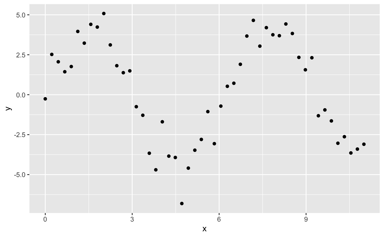
I’m going to fit five models to this data.
mod1 <- lm(y ~ ns(x, 1), data = sim5)
mod2 <- lm(y ~ ns(x, 2), data = sim5)
mod3 <- lm(y ~ ns(x, 3), data = sim5)
mod4 <- lm(y ~ ns(x, 4), data = sim5)
mod5 <- lm(y ~ ns(x, 5), data = sim5)

grid <- sim5 %>%
  data_grid(x = seq_range(x, n = 50, expand = 0.1)) %>%
  gather_predictions(mod1, mod2, mod3, mod4, mod5, .pred = "y")

ggplot(sim5, aes(x, y)) +
  geom_point() +
  geom_line(data = grid, colour = "red") +
  facet_wrap(~ model)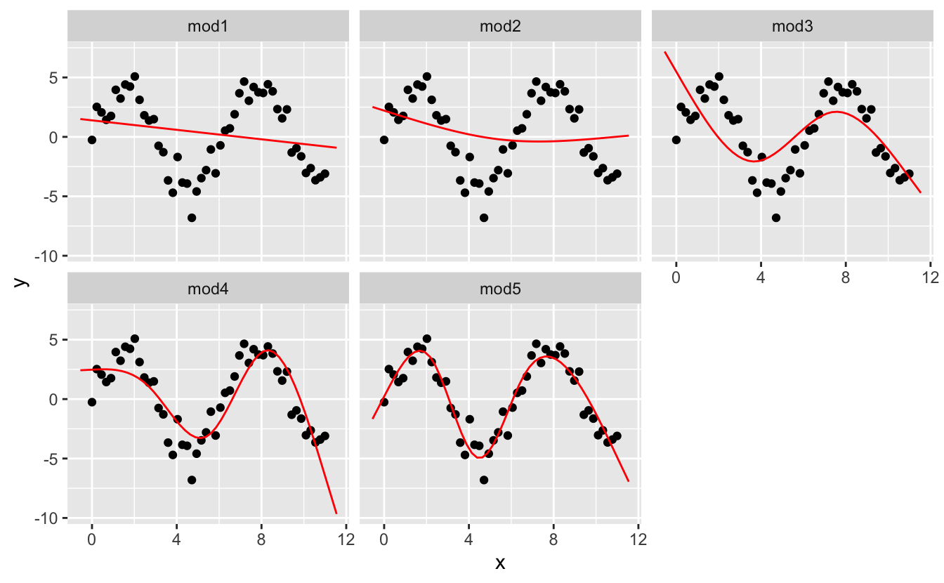
Notice that the extrapolation outside the range of the data is clearly bad. This is the downside to approximating a function with a polynomial. But this is a very real problem with every model: the model can never tell you if the behaviour is true when you start extrapolating outside the range of the data that you have seen. You must rely on theory and science.
Missing values obviously can not convey any information about the relationship between the variables, so modelling functions will drop any rows that contain missing values. R’s default behaviour is to silently drop them, but options(na.action = na.warn) (run in the prerequisites), makes sure you get a warning.
df <- tribble(
  ~x, ~y,
  1, 2.2,
  2, NA,
  3, 3.5,
  4, 8.3,
  NA, 10
)

mod <- lm(y ~ x, data = df)
#> Warning: Dropping 2 rows with missing values
To suppress the warning, set na.action = na.exclude:
mod <- lm(y ~ x, data = df, na.action = na.exclude)You can always see exactly how many observations were used with nobs():
nobs(mod)
#> [1] 3This chapter has focussed exclusively on the class of linear models, which assume a relationship of the form y = a_1 * x1 + a_2 * x2 + ... + a_n * xn. Linear models additionally assume that the residuals have a normal distribution, which we haven’t talked about. There are a large set of model classes that extend the linear model in various interesting ways. Some of them are:
Generalised linear models, e.g. stats::glm(). Linear models assume that the response is continuous and the error has a normal distribution. Generalised linear models extend linear models to include non-continuous responses (e.g. binary data or counts). They work by defining a distance metric based on the statistical idea of likelihood.
Generalised additive models, e.g. mgcv::gam(), extend generalised linear models to incorporate arbitrary smooth functions. That means you can write a formula like y ~ s(x) which becomes an equation like y = f(x) and let gam() estimate what that function is (subject to some smoothness constraints to make the problem tractable).
Penalised linear models, e.g. glmnet::glmnet(), add a penalty term to the distance that penalises complex models (as defined by the distance between the parameter vector and the origin). This tends to make models that generalise better to new datasets from the same population.
Robust linear models, e.g. MASS::rlm(), tweak the distance to downweight points that are very far away. This makes them less sensitive to the presence of outliers, at the cost of being not quite as good when there are no outliers.
Trees, e.g. rpart::rpart(), attack the problem in a completely different way than linear models. They fit a piece-wise constant model, splitting the data into progressively smaller and smaller pieces. Trees aren’t terribly effective by themselves, but they are very powerful when used in aggregate by models like random forests (e.g. randomForest::randomForest()) or gradient boosting machines (e.g. xgboost::xgboost.)
These models all work similarly from a programming perspective. Once you’ve mastered linear models, you should find it easy to master the mechanics of these other model classes. Being a skilled modeller is a mixture of some good general principles and having a big toolbox of techniques. Now that you’ve learned some general tools and one useful class of models, you can go on and learn more classes from other sources.